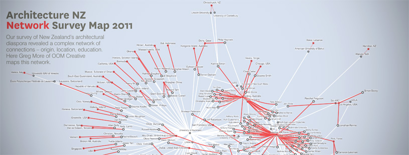
Survey Visualisation
A network visualisation illustrating how architects are connected through survey data — mapping cities where graduates currently work against the architectural schools they studied at.
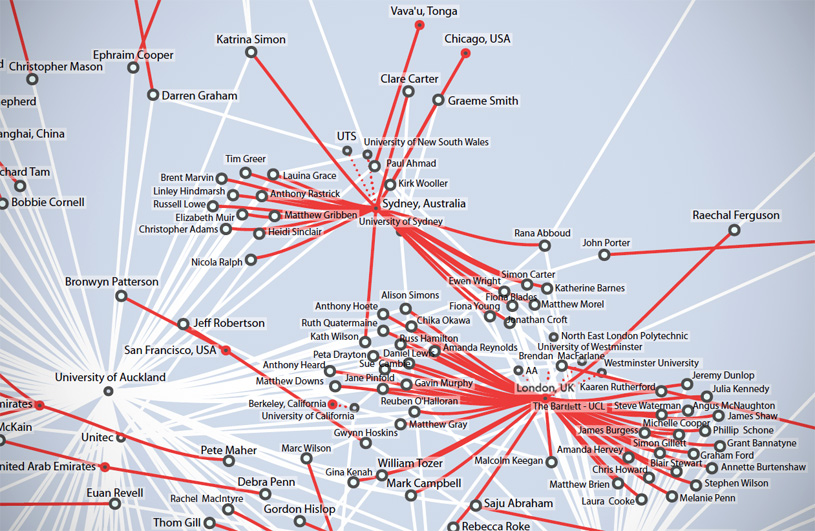
Invited by the guest editors of Architecture New Zealand magazine (Justine Clark, Peter Johns, Paul Walker) — for an issue on architects working overseas — this graphic illustrates what cities most graduates are currently working in versus what architectural schools they studied at.
Approach
This network visualisation was generated using a force-directed graph using the Python iGraph library and a Fruchterman-Reingold layout. Conceptually, the idea was to float the connections between people and their current cities above, and beneath show their connections between universities.
- White: Connection to place of study
- Red: Connection to current location