World Data Visuals
A projected data visualisation piece for the Make Change exhibition at the Asia Pacific Triennial in Brisbane — presenting country data as animated global and regional views across four sequences.
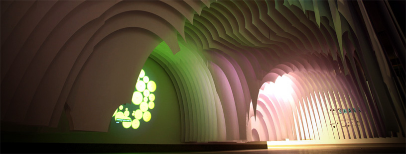
At the Unlimited: Designing for the Asia Pacific Triennial in Brisbane, Australia, 4–10 October 2010, we developed a projected data visualisation piece with senior curator Fleur Watson and the exhibition design team March Studio.
The brief was to present the macro view for each country of the 12 featured design works. How can data tell a story that extends the audience’s understanding of the design artifacts?
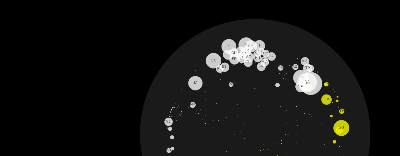
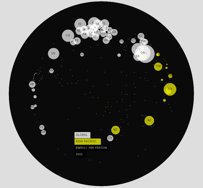
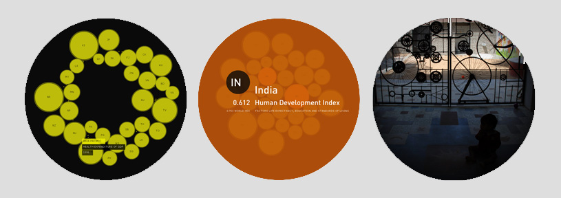
The data visuals present a global view of world data animated over time (1). Each sequence has a specific theme — for example, the number of people affected by flooding, or CO2 emissions per person. The view then morphs into a focused view of the Asia Pacific region, not as a map but as circles packing together like organisms wrestling for space (2). Finally, the countries of the specific case studies are studied with stats (3) and flashes of project imagery (4), which connects back to the original dataset presented.
Project Credits
Visualisations: Greg More, OOM Creative
Sound design: Marco Cher-Gibard